Choosing a colour palette, shape, pattern and layout should be the fun part of the design process, but all too often we forget about an equally important design element – the colour of the grout.
Grout colour can highlight elements of your tile, fade into the background, or completely steal the show — either way, choosing the right grout colour is critical to the design. We have provided you with some key considerations, ideas, and frequently asked questions to help you find the perfect grout for your space:
APPLICATION SIZE
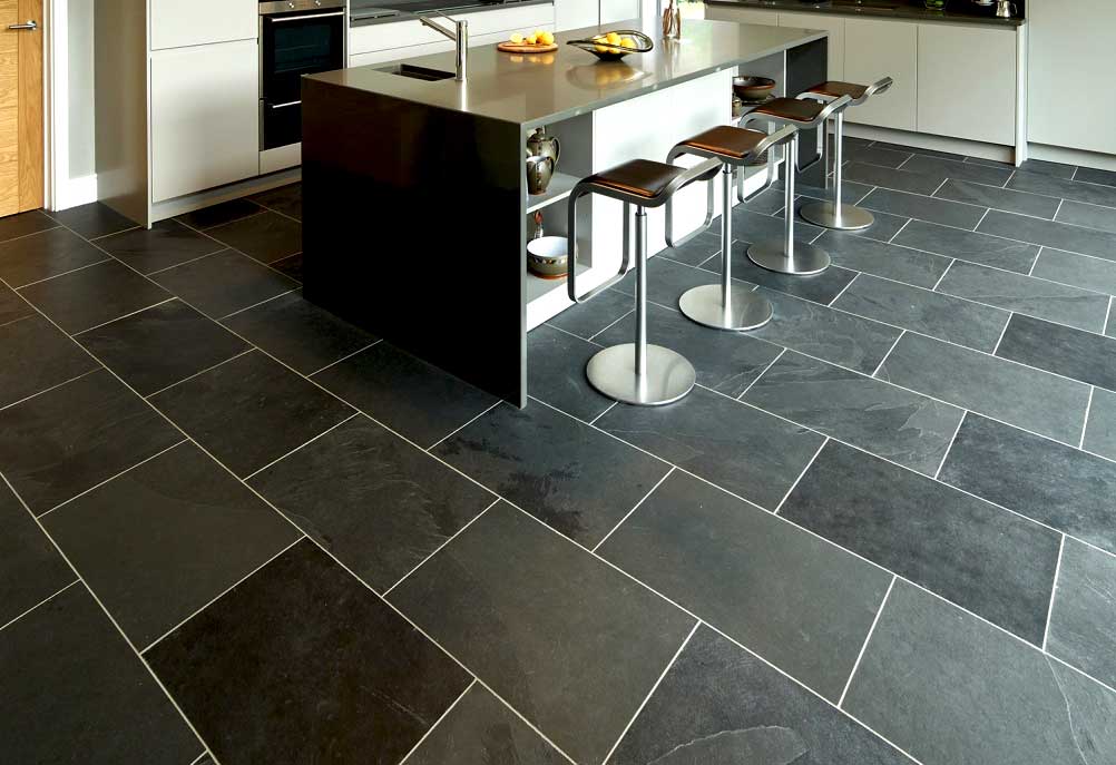
The size of the space can influence the colour you choose? Grout colours that contrast with your tile colour will create a more complex look, which may be overwhelming in a large space. Matching grout to the tile colour, on the other hand, creates a more continuous surface visual and can assist with making a smaller space appear larger.
TILE LOCATION
Wall tiles may be in your direct line of sight, making your grout colour decision more visible than it might be when applied to the floor.
DESIGN COMPLEXITY
While the size and location of your tile impacts the tile installation design, your grout colour choice gives you the opportunity to influence your design complexity in any space.
Remember these general rules:
- matching grout and tile colours – you can create a minimalist look with the grout lines fading into the background.
- contrasting colours for your tile and grout make for a more dynamic design.
- For a look that splits the difference, pair your tile with a mid-toned neutral grout colour, such as gray.
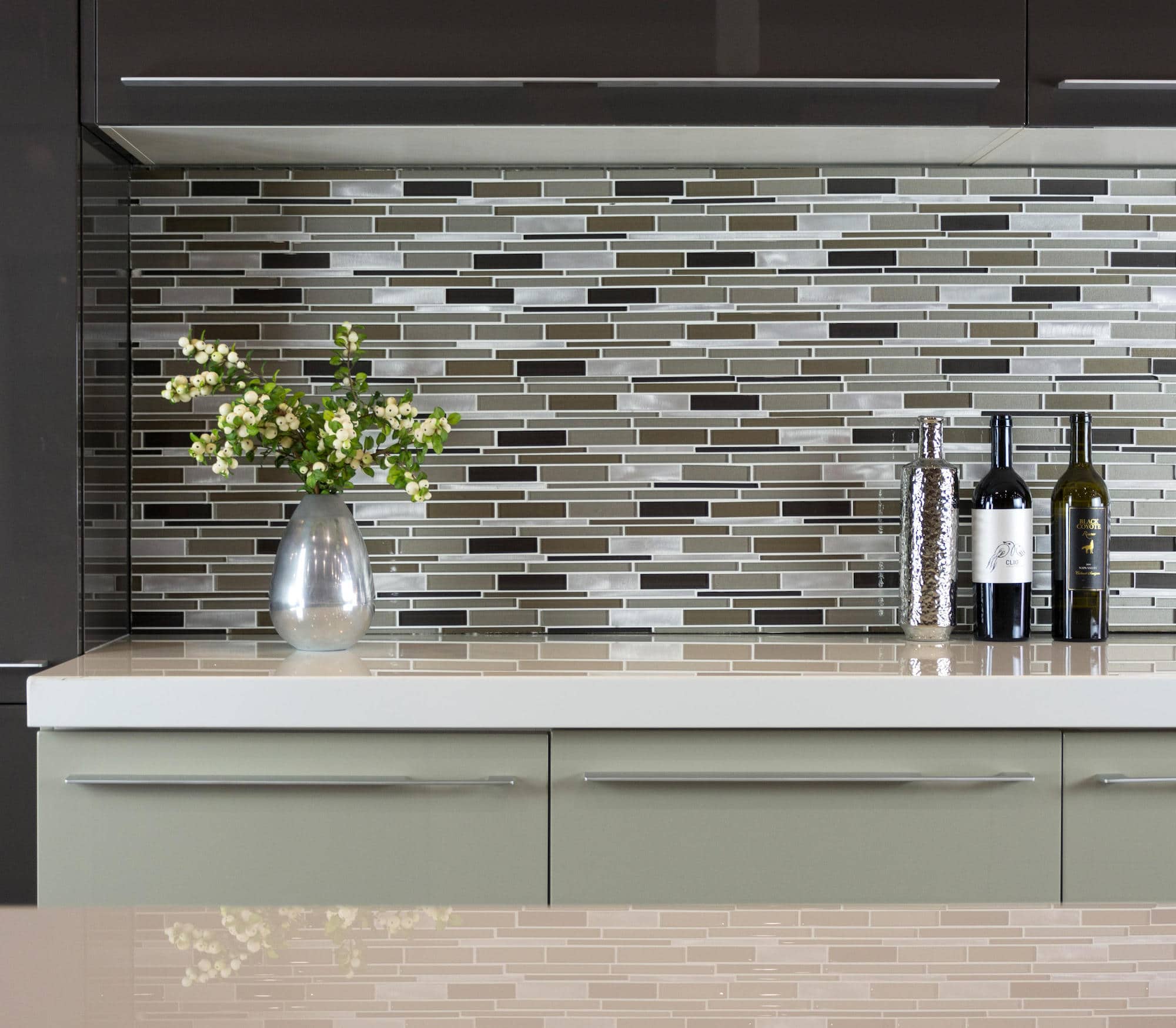
PATTERNS
If your tile itself is patterned, you may want to use thinner grout lines (as allowed per manufacturer instructions) or use neutral grout to let the pattern be the focus.
On the other hand, grout is a great way to draw attention to your tiles.

MATCHING YOUR DESIGN DECOR
You obviously want your grout colour to complement your tile colour, but don’t overlook the rest of your design decor.
Grout colour may look less bold if it picks up the tones in the rest of the space.
Before you settle on a specific grout colour, ask your contractor or designer for grout swatches (yes, just like with paint colours) to compare to the other colours in your space.
TILES EDGES
Rectification is a tile edge treatment that cuts tiles to a more exact size, resulting in crisp tile edges. Because rectified tiles are more of an exact dimension, they can often be placed closer together than non-rectified tiles and can have more narrow grout lines.
Non-rectified tiles typically have more variation in size, so wider grout joints may be used to provide a more uniform appearance.
Neither of these tile edge types is better than the other, so consider which look you want for your tile, the size you prefer for your grout lines, and what is recommended by the manufacturer. Whether you choose rectified or nonrectified tile edges, your choice of grout colour can draw more or less attention to the grout lines.
PLAYFUL GROUT LINES
In addition to the tile edges, you can play with the consistency of the grout lines. Curved tiles especiallypresent the opportunity for unique grout lines that are thicker in some places than others.
TILE FINISH
Glossy tiles, high-sheen tile, and mirrored tiles reflect light, which can make it look lighter in your space than it does when you’re looking at a sample. Keep this in mind when choosing a grout colour and consider shades in a lighter colour than you might otherwise choose.
Meraki Ceramics tip: Selection of a grout colour that contrasts with the tile will emphasise the grout joint and correspondingly any variations in tile size and position. Selection of a similar or complementary grout colour will de-emphasise such variations.
We hope this blog has been useful to you and please get in contact should you need any further information.