The perception of colour and the determination of associated emotions or feelings is an intricate mechanism. The human mind is both a complex and enigmatic faculty; its uniqueness from one individual to the next makes it challenging to ascertain a generalised impact of a specific sensation. But colour psychology is very well established, and it is widely acknowledged that the colours of our surroundings do have profound psychological effects.
In this blog post, we provide an overview of colour in interior design, and how we can use specific colours to effectively dictate the experience of the space in the end user.
As a designer, one of the first disciplines we study is that of colour psychology. Using the correct colour combination can be the catalyst to accomplishing the desired effect for a room or space – which could be to boost productivity, enhance a mood, or present a space within which one feels serenity and calm.
COLOUR GROUPS
There are two predominant colour groups: warm and cool. Warmer colours are more saturated, and include colours such as red, yellow and orange. These colours tend to be associated with passion, energy and, especially in the case of red, anger.
Cool colours on the other hand, we connect with feelings of peace, harmony and nature, however they can also reflect melancholy, detachment and, to a certain degree, stagnation.
Below we provide an overview of colours and the effect they have on human emotions:
BEIGE
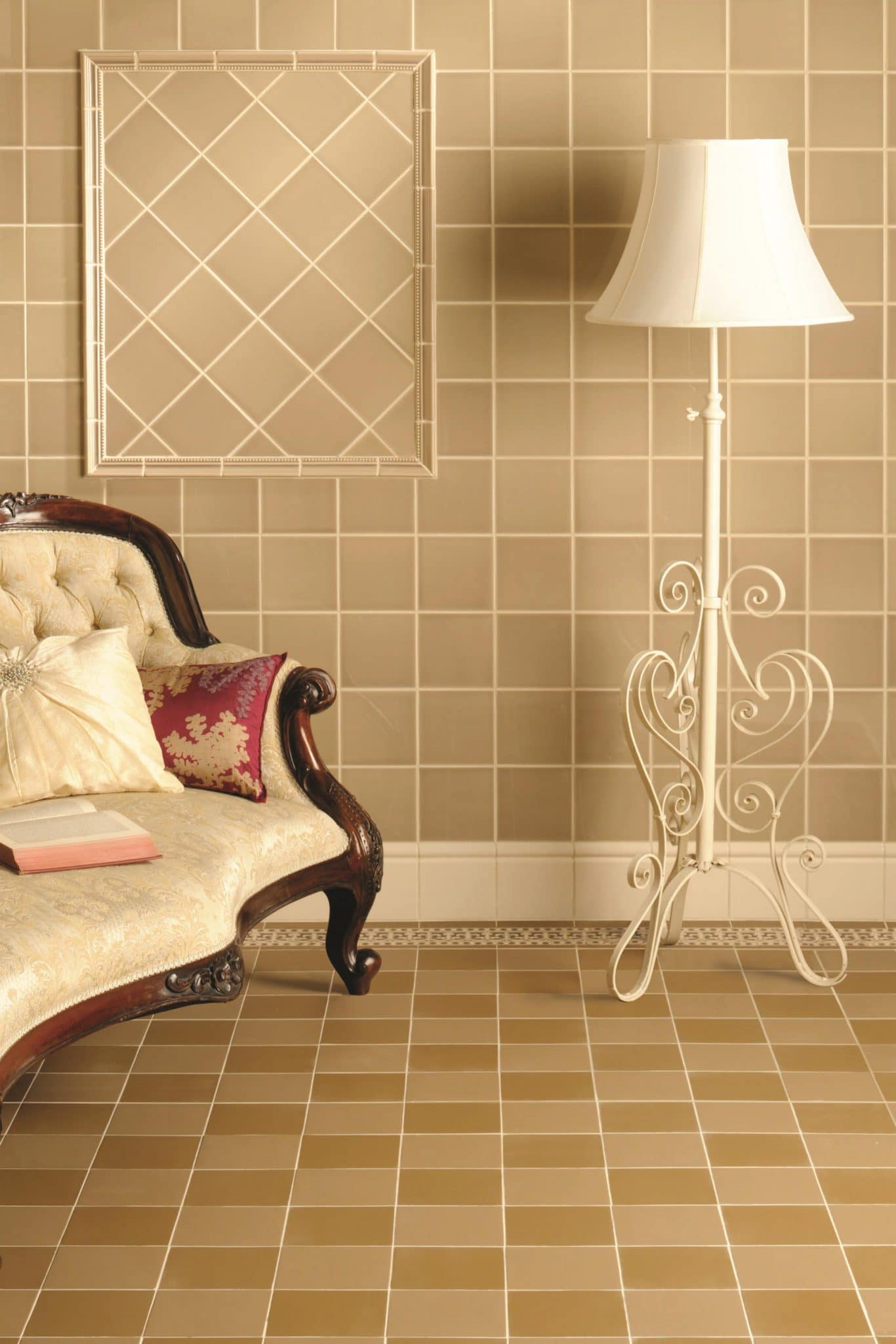
As an architect headquartered in Dubai, we often hear remarks referring to the beige colour of buildings and interiors in the emirate. And throughout the city there is an abundance of beige, taupe, cappuccino, tan, off-white, etc., the list could go on almost indefinitely. But this is for good reason. Beige and all its associated neutral hues is chosen because it is proven to elicit feelings of serenity, safety and simplicity. In Dubai, where deadlines are tight and life moves by at quite a pace for most of the time, the use of beige in design provides the end user with a greater sense of calm related to their surroundings. As a base colour for walls, beige is versatile, natural and uplifting. It has a less overbearing effect than that of a brilliant white or cream (particularly in well-lit rooms), and is the perfect natural canvas for a multitude of more adventurous colours.
PINK
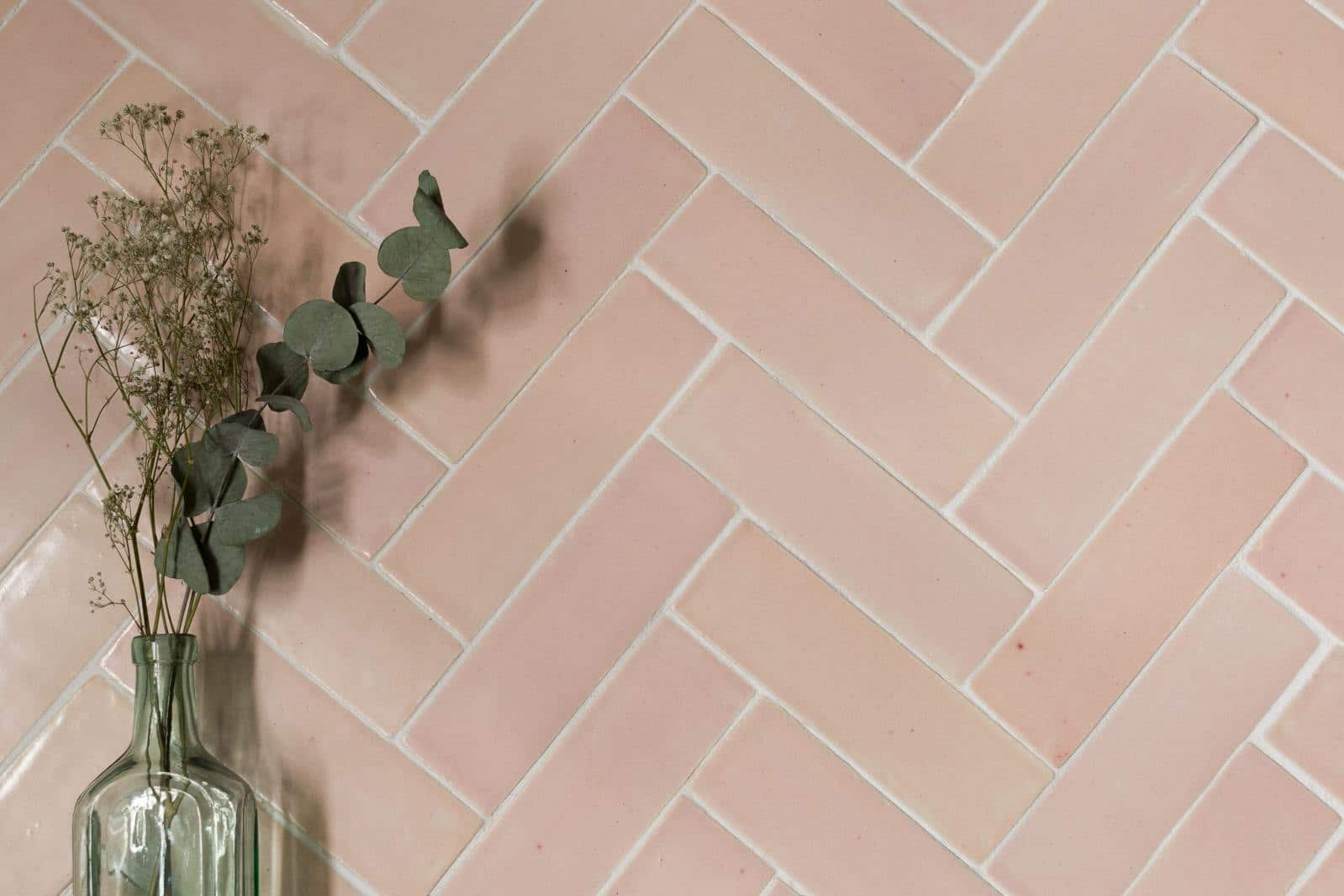
A fact not widely known is that up until 100 years ago pink was the colour of boys, and blue the colour for girls. Pink was seen as a stronger, more masculine colour, while blue was more elegant and graceful. The power of perception through association can be shifted over decades. Pink is still regarded as a powerful colour, and many pink items, such as razors, pens, headphones, cost more than other colours (the so-called ‘pink tax’). This is because we all love pink. It is calming, it is proven to reduce heart rate in times of stress, and is even used to placate rowdy prisoners in correctional facilities across the US. A pastel pink, or even the amazing colour of the year for 2019, Living Coral, have a positive and comforting impact on all end users, both male and female. It’s only the very recent association with femininity that perhaps stops the use of pink hues in more public areas.
BLUE
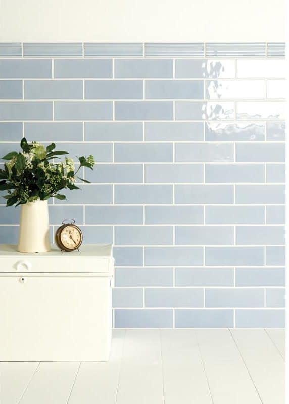
Blue was found to be the most-loved colour in the world, according to a poll by YouGov. But while some of the world’s greatest natural features, such as the sky and the sea, are blue in colour, when we verbally or mentally consider the concept of ‘feeling blue’, it’s not such a thing of beauty. But having the blues, it turns out, is more of a verbal expression than a sensory emotion associated with the colour. But it is the shade of blue that dictates the feeling blue perpetuates among its audience. Lighter blues give more calm, and can actually be mood enhancing, while deeper blues, and also the use of too much blue, can have the opposite effect. Blue is also a versatile colour, and can be mixed with harmonious greens or greys, as well as popping fire colours such as red or yellow.
A brief overview of the positive and negative effects of other popular colours:
RED
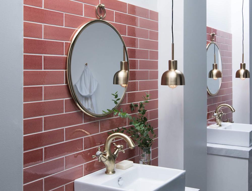
Positive Effects:
Associated with love and romance
Symbolises confidence and courage
Increases energy levels
Negative Effects:
Overuse can result in elevated levels of anger, stress
Is a colour associated with heat and is not often adopted in hot countries
The colour of the devil, in some quarters is thought to provoke wickedness.
YELLOW

Positive Effects:
The colour of sunshine and happiness
Provides energy, optimism and enlightenment
Embodies confidence and provides mental stimulation
Negative Effects:
Linked to cowardice
An unstable colour
Too much yellow results in disorientation and loss of focus.
GREEN
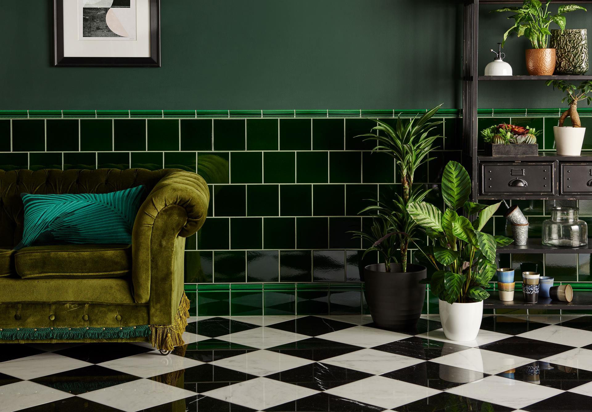
Positive Effects:
The colour of nature, of life
The most dominant colour of the spectrum
Perfect for interiors as a base colour because humans are so used to seeing it
Associated with renewal, energy, freshness and health
Negative Effects:
Attached to jealousy and envy
The colour of money and greed
Too much green can invoke lethargy and detachment.
WHITE
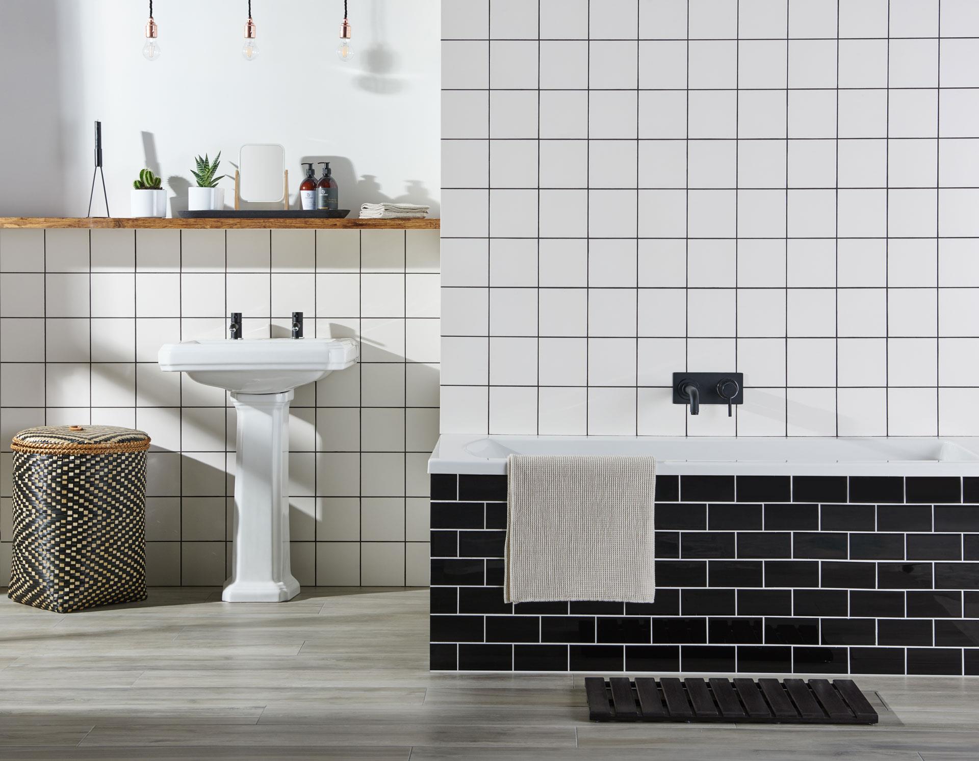
Positive Effects:
Purity, innocence and goodness
Is simple, neutral and clean
Aids mental clarity and purification of moods and thoughts
Negative Effects:
Can induce headaches, particularly if a “bright white”
Is cold, the colour of snow and ice
When placed alongside warmer colours can make them feel garish or tasteless.
BLACK
Positive Effects:
Goes with everything
Embodiment of sophistication
Has a mysterious, chic and attractive quality
Negative Effects:
Is associated with fear, death and sometimes evil
The darkest colour, can darken a mood, particular an already negative mindset.
PURPLE
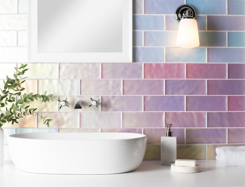
Positive Effects:
Promotes spiritual awareness
Encourages mindfulness and meditation
Negative Effects:
Overuse can be disorientating
Sometimes associated with unnecessary flamboyance.
ORANGE
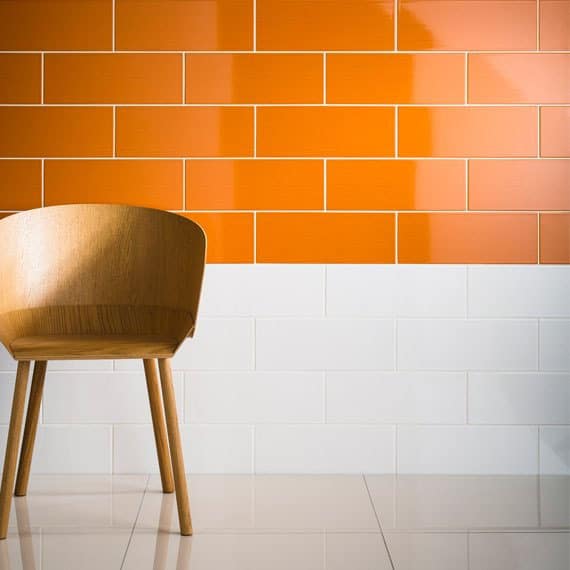
Positive Effects:
Energetic, playful and happy colour
Boosts social interaction and mental activity
Aids confidence and decision making
Negative Effects:
Increases feelings of hunger
Overuse of orange can have self-serving impacts on the end user, such as arrogance, pride, lack of empathy.
GREY

Positive Effects:
Modern, smart and timeless
Sophisticated, neutral and cool
As a combination of black and white, grey presents the best of both colours.
Negative Effects:
Can be dull, uninspiring
Thought to be unsettling if overused
In some quarters considered very conservative and non-adventurous.
When using colour, it is important to consider the space and the feelings we hope to promote in the end user. The key is often balance. Overuse of a certain colour can have the opposite effect to that which is intended. Mixing the wrong colours creates discord and disharmony. Overall, selecting a neutral base colour such as beige or an off-white provides the ideal foundation from which to add more adventurous tones without being garish or overbearing.
Contact The House of Tiles today to discuss your project requirements!